Analysis of front page image:
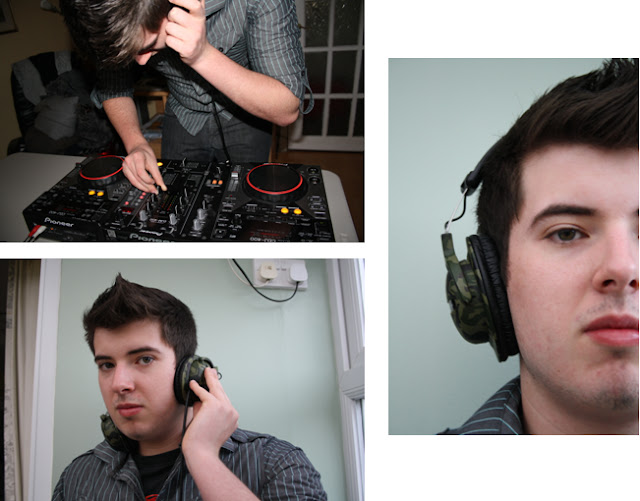
I have looked through all of my images and have decided to use this image to use for my front page on my music magazine to connect with the genre of trance.
The colour orange on the decks has given me a suggestion to use orange, black and white for my main colour scheme. Generally in a club, they would have orange lazers spreading all over to create a ‘trance’ atmosphere. This could help to give a similar feel on my front page.
This image has a strong use of direct mode of address which connects with the target audience. If this image was on the front page, while being on the shop shelves it would stand out to the public.
His costume is quite simple, for example there aren’t any bold logos or writing to distract them from his face. He looks smart and ready to DJ. This makes him look professional and enthusiastic towards the music which could inspire the target audience. His body language gives off a positive feel from the way he has placed his hands on the prop. He would let the audience know that he enjoys DJing.


No comments:
Post a Comment